
Weversi is a startup entering the highly competitive travel and crowdfunding platform market. The core business challenge was the necessity of establishing a strong, unique visual identity that clearly communicated the concept of community, shared economy, and emotional travel experiences.
Market Differentiation: the brand needed to be modern, inviting, and fundamentally different from traditional travel aggregators (e.g., Booking, Expedia) and existing crowdfunding platforms (e.g., Kickstarter, GoFundMe).
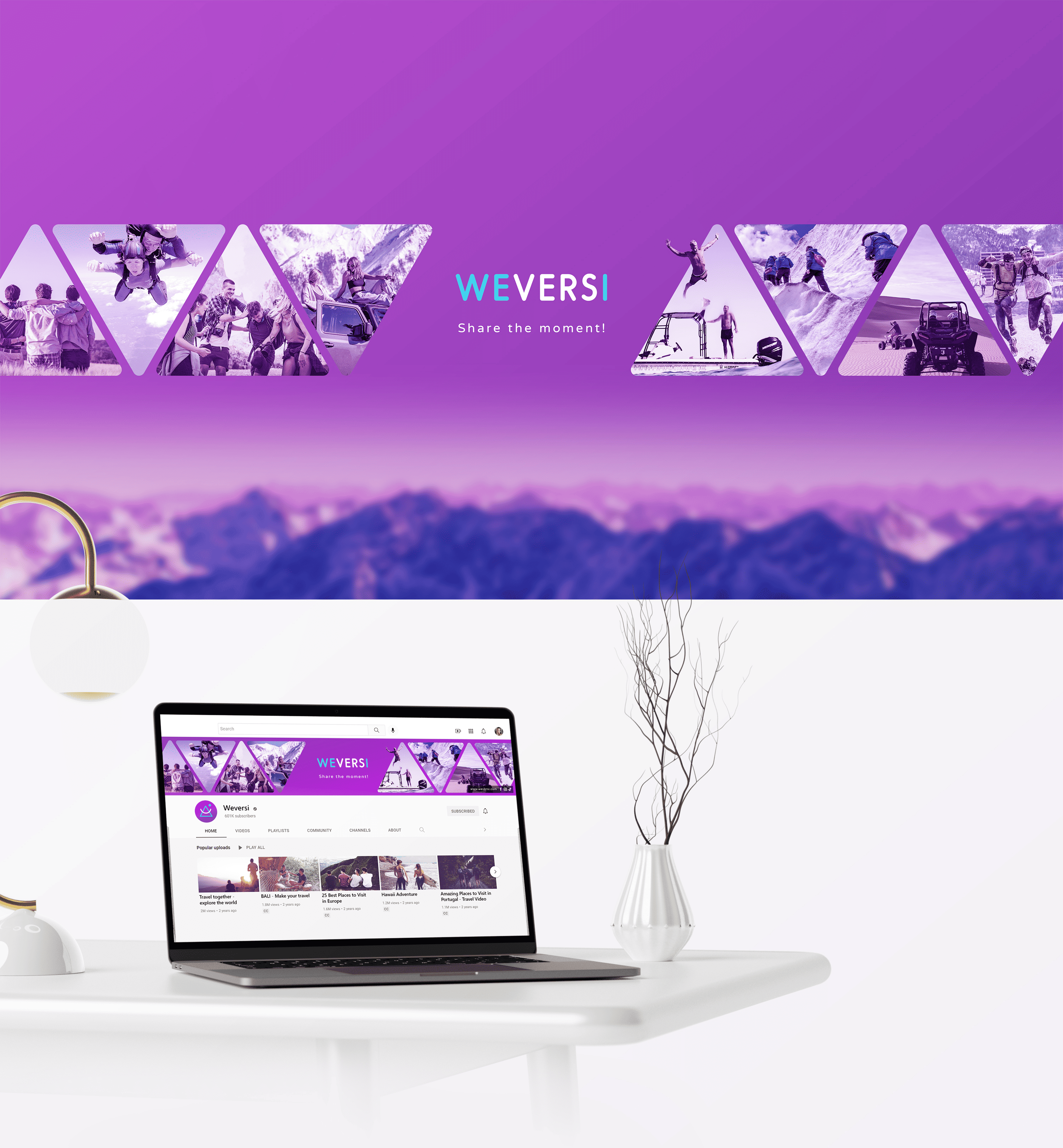
Value Communication: the visual language had to effectively reflect the idea of “people connecting their individual journeys into one shared adventure” (the shared economy concept).
Digital Adaptability: the branding had to be highly flexible for seamless implementation across mobile apps, web platforms, and motion graphics - from the logo loader to the entire icon system.
Building Trust: as a financial platform, the design was required to evoke trust and reliability while remaining emotional and inspiring to engage the target audience.

My approach was anchored in developing a Concept focused on emotion and connection. I identified the shared goal and emotional aspect of travel as the central element uniting the platform's users.
Modular Logo System: to address the Value Communication and Digital Adaptability challenges, I developed a logo based on three core, flexible elements: a Triangle (symbolizing location/mountains), a Circle (representing globality/route), and a Stylized Smile (representing the human element/emotion).
Flexible System Implementation: this modularity not only grounds the concept but also solves the Adaptability requirement: the logo elements were easily transformed into a comprehensive system of stylized icons (Emojis), used across the User Interface (UI) and marketing materials.
Color Palette: the primary palette consists of Blue (chosen to convey trust, globality, and reliability) and Purple (to highlight the platform’s uniqueness and creativity). Orange was selected as a strong accent color, symbolizing energy, adventure, and emotion. This combination provided the brand with recognizability and the necessary level of trust.


The compartmental design of the logo allowed me to adapt its elements for use in various stylized symbols and icons applicable to web design and documentation.


Discover how WEVERSI’s identity evolves across social media - sleek, playful, and made to move.