Small and Medium Businesses (SMBs) often struggle with operational chaos. Most AI solutions feel cold, overly technical, and intimidating. The goal was to build a bridge between high-end technology and human-centric design.
• Humanize AI: Develop a relatable mascot that acts as a friendly guide, not just an interface.
• Strategic Visuals: Create a sleek, professional UI that feels futuristic yet intuitive.
• Engagement through Motion: Use high-level interactivity to increase user retention and simplify complex data.
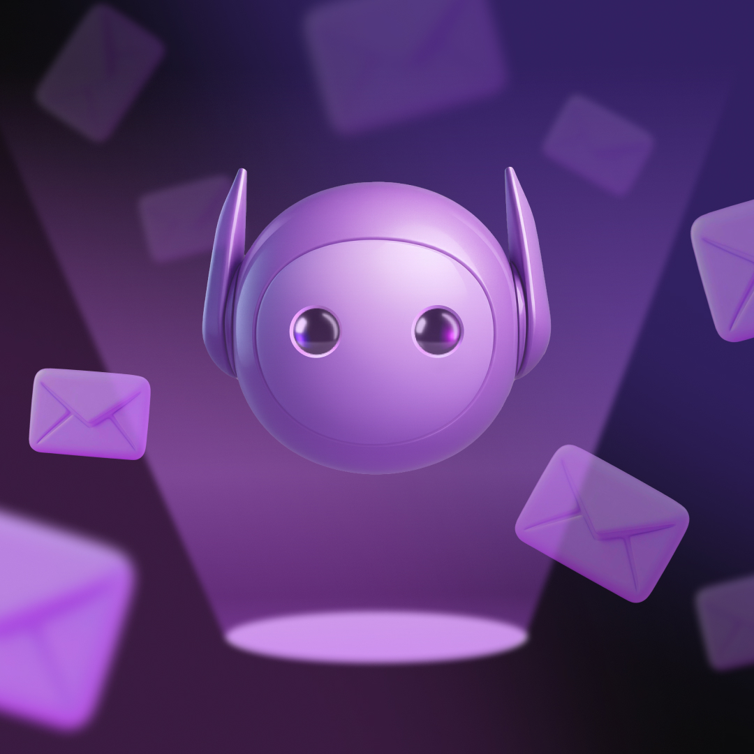
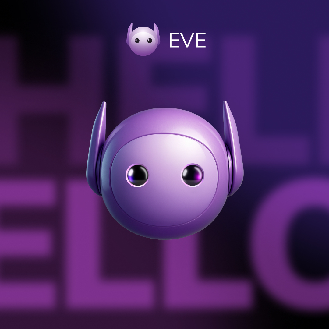
I moved away from standard flat illustrations in favor of an interactive 3D mascot. EVE is not just a visual asset; she is the core of the user experience, reacting to the visitor’s actions in real-time.
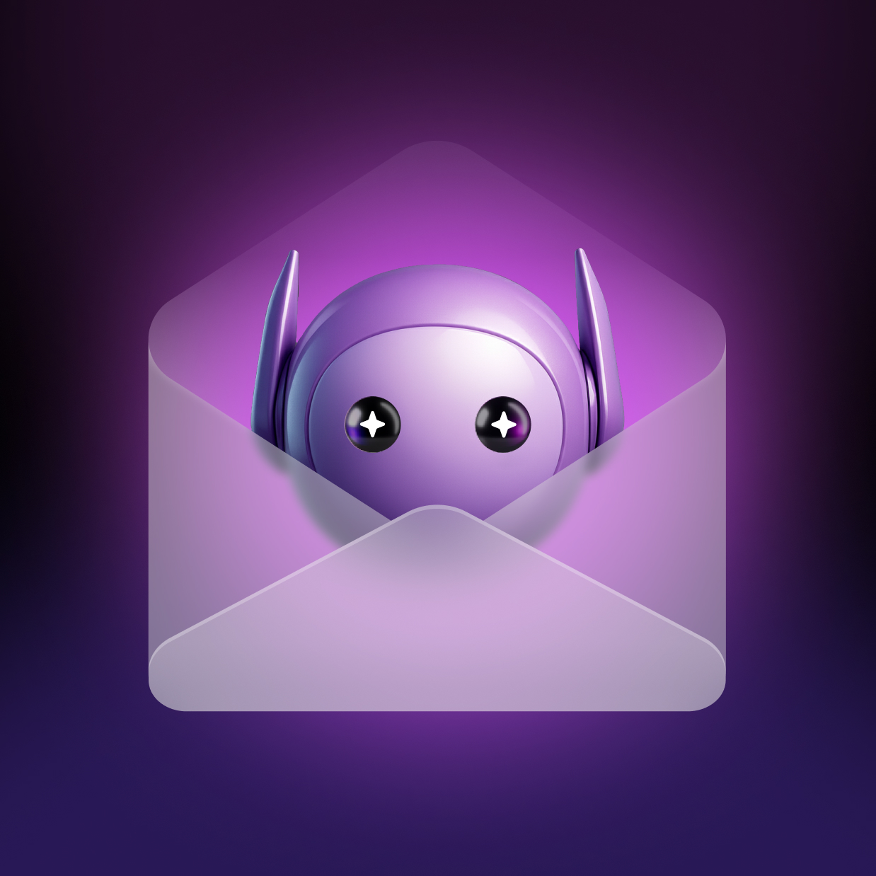
The Mascot: EVE was designed as the emotional anchor of the product — a character that transforms an abstract AI system into a relatable presence. The focus was on creating a form that feels intelligent, lightweight, and subtly expressive rather than decorative.
Visual Strategy: I implemented a sleek, high-contrast aesthetic—pairing an authoritative dark base with vibrant primary colors (Pink, Purple and Blue) to signify innovation and professional agility.
Searching for the Personality
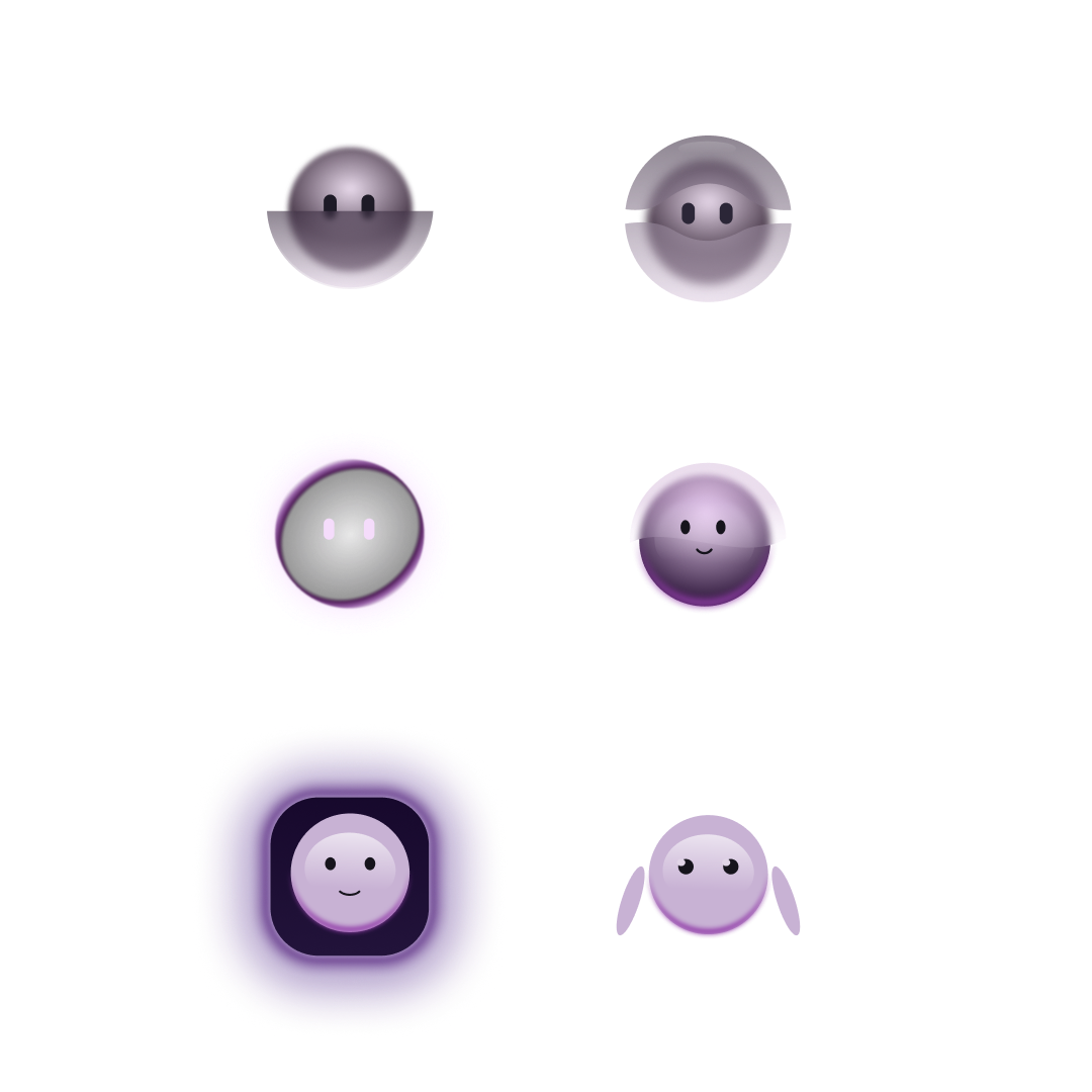
The initial phase prioritized concept over visual refinement. The goal was to define how the AI product should feel — focusing on trust, clarity, and approachability. The first version of EVE explored:
• Minimal character design
• Human vs. technological balance
• The mascot’s impact on AI perception.
This iteration functioned as a research step, validating tone and brand direction.
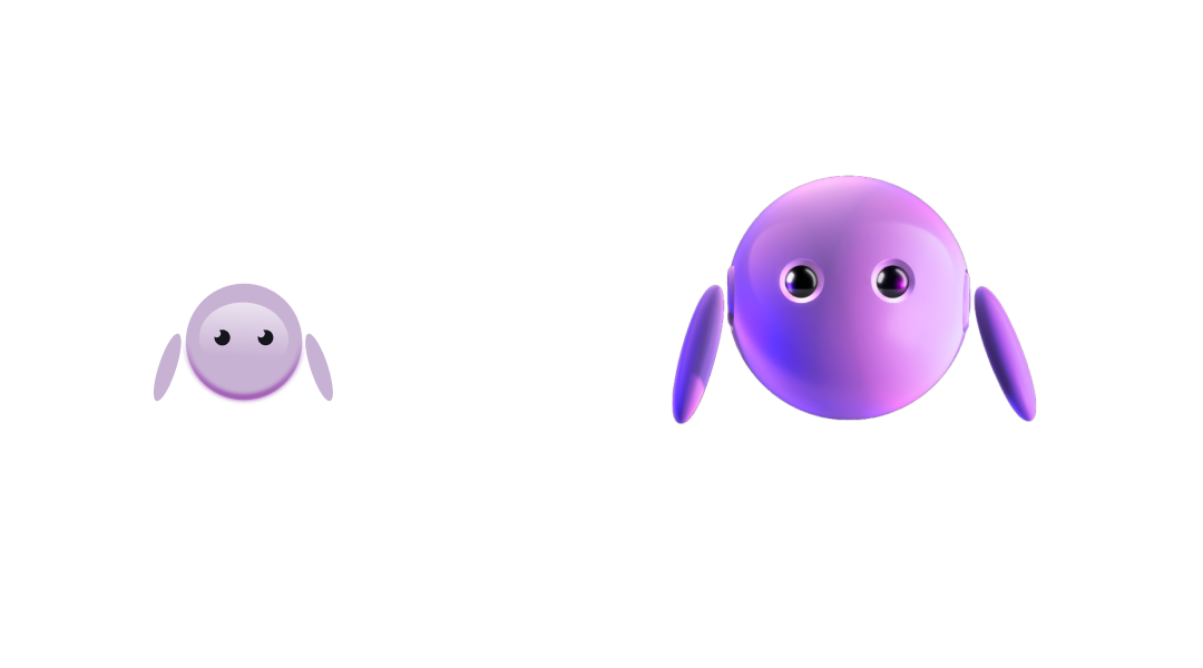
After finalizing the 2D brand marks, I translated the concept into a 3D version using Spline. Integrated into Webflow, Eve responds to user presence through subtle behaviors - she follows cursor movement and features gentle eye and hand animations - creating a sense of liveliness and immediate engagement.

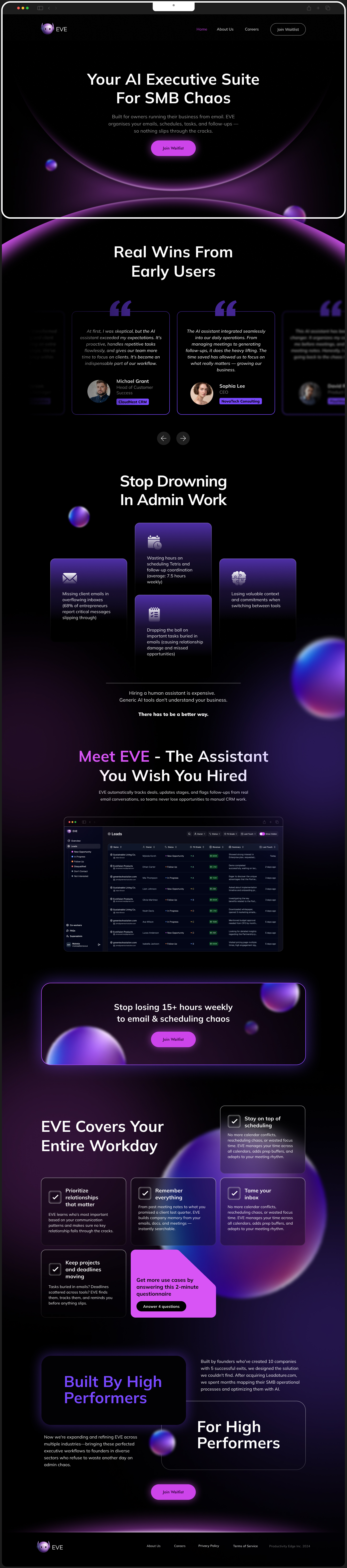
The first version of the EVE website focused on validating the core concept and establishing an emotional connection with users. It was designed to:
• Clearly introduce the product’s value — an AI executive suite
• Showcase the mascot as an anchor that embodies brand personality
• Present key features without overwhelming the audience
• Use interactive elements to increase engagement and curiosity.
The layout prioritized clarity and visual storytelling, guiding visitors from pain (complexity of AI) to solution (EVE’s approachable AI assistance). The result was a platform that communicated identity, value, and intrigue with simplicity and purpose.

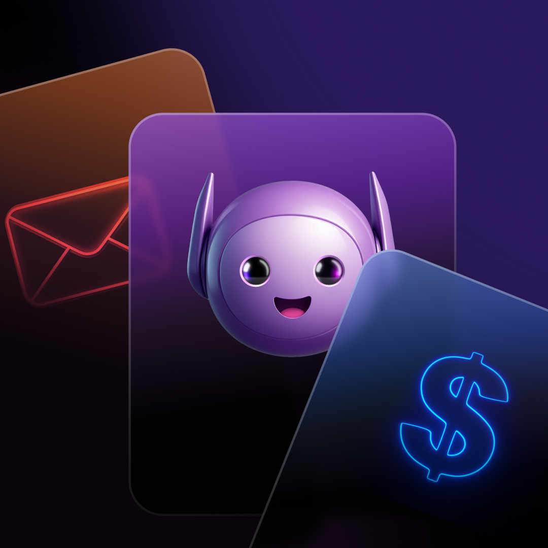
As the product vision matured, it became clear that EVE needed more than friendliness - she required stronger identity, confidence, and presence.
The second version was not a cosmetic update but a conceptual evolution. Using only the 2D version as a base, I leveraged MidJourney, ChatGPT, and Nana Banana to create the 3D mascot. This approach allowed me to expand the character into a fully realized, dynamic form while maintaining design consistency.
Key improvements:
• Enhanced character definition and personality
• More deliberate visual language
• Stronger alignment with a B2B / executive product context.
The goal shifted from “making AI feel friendly” to: “Making AI feel intelligent, reliable, and essential.”
(Strategic Refinement)
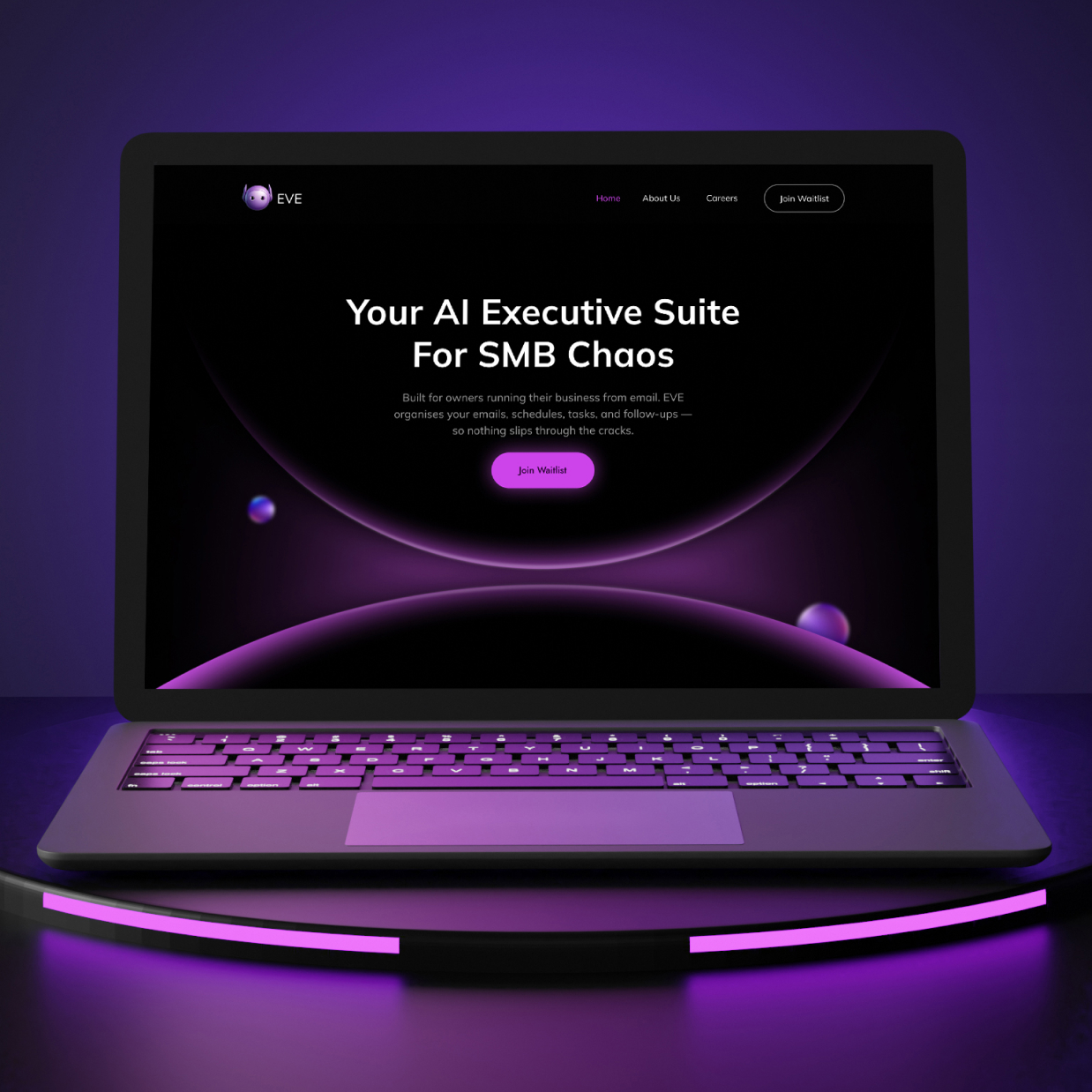
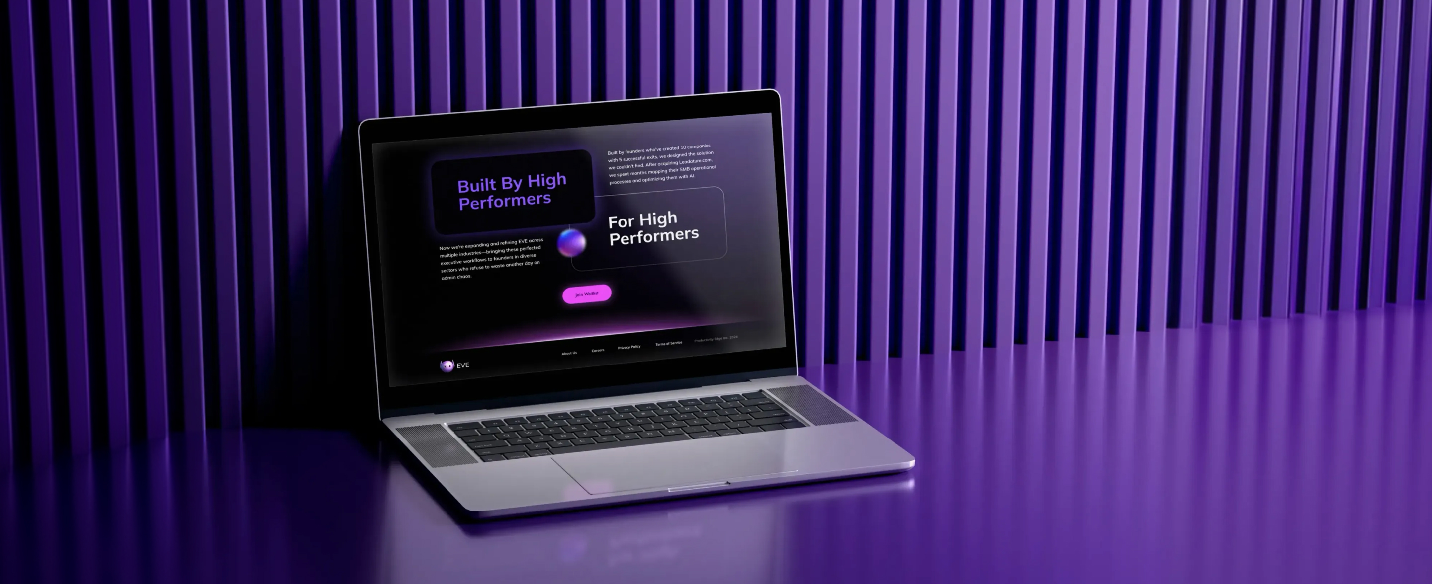
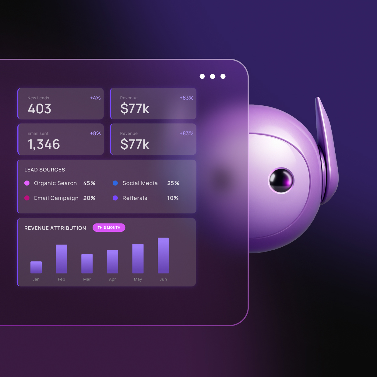
The updated version builds upon the first, refining structure, content hierarchy, and interaction quality to better support conversion and product positioning:
• Stronger visual hierarchy: clearer paths from headline → benefit → action
• Improved messaging: more concise, benefit-driven language that speaks directly to SMB needs
• Enhanced interactivity: UI behaviors that guide attention without distraction
• Better alignment with product maturity: the site now reflects a more confident, reliable, and executive-focused tool
This version elevates user understanding and retention, reduces cognitive load, and makes the product story easier to grasp in seconds — a key advantage for B2B audiences.